Professor Strangeweather Remix
Professor Strangeweather (remix) by Jason Matthews, Aaron Parks
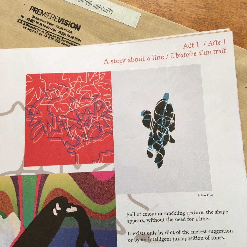
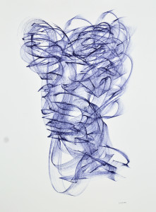
artwork & video by Ross Ford
released June 19, 2019
Jason Matthews – remix, production, additional keyboards (prophet, hammond m3, arturia microbrute, microkorg xl)
Aaron Parks – piano, keyboards
Greg Tuohey – guitar
David Ginyard – bass
Tommy Crane – drums
stems taken from Aaron Parks ‘Little Big’ album purchase “Little Big” here – http://bit.ly/2KC7olR
subscribe to Aaron’s youtube – http://bit.ly/2J8uoVo
Jason Matthews on bandcamp: http://jasonamatthews.bandcamp.com
Ross Ford on Instagram: http://instagram.com/rossfordart