Number 423
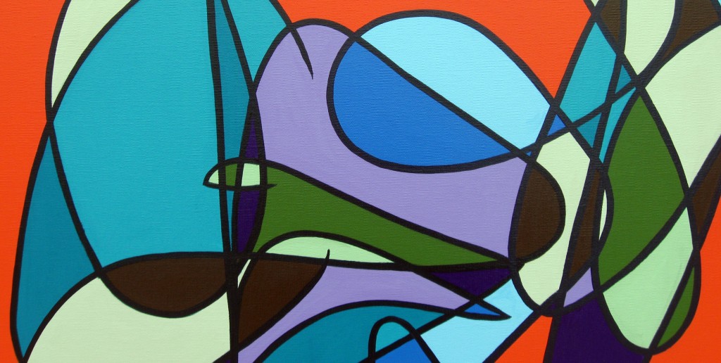
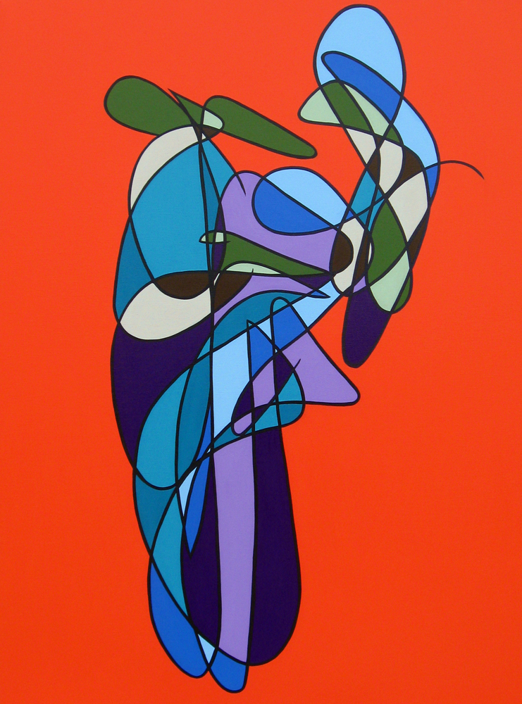
Hard to believe it’s the end of March and this is the first painting of 2012, Number 423. I have been focused on the prints since January so I haven’t spent much time actually painting. It’s been a lot of fun but I needed to paint. I am still planning a giant painting on this roll of canvas I have.The plan has been to go very heavily multilinear on that since I will have space to put a lot of lines. This sketch was not dense enough for that size but I really liked it so I painted it at my regular size of 3’x4′.
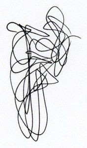
2012_02_25-_8-00am001
Color
So first off, this is a palette switch from the last group of paintings. Notably the addition of the orange but also brown instead of yellow and a different pigment green. My last group had some orangey reds, but everything was squarely on the red end of the spectrum. This is definitely orange. I admit it was added because of the red-orange I have been using on the prints. I loved the effect when used with the purples, turquoise and green. The other change is the green is chromium oxide which has a matte finish and an earthy tone compared to the bright phthalo green. It is one of my favorite colors.
Besides the pigment changes, there has been a color pattern change as well. The previous two sets of paintings used 3-level sets for the interior space but in this painting I am using 2-levels. This painting has 5 colors in heavy and light saturation pairs, plus orange. The multilinear red/turquoise/purple/yellow/green paintings from last year (414–422) had two major interior colors and 2 minor interior colors in sets of 3 levels of saturation. Fourth levels of saturation were used for line or background. The yellow series (406–413) before that had a 5-level major color and two minors. The interior space of both groups of paintings was limited to 3 saturation levels of each color.
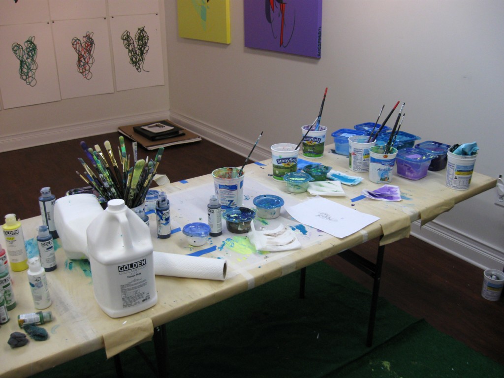
10 colors in light and heavy saturation pairs. At the time that I took this photo I had not yet mixed the big vat of orange.
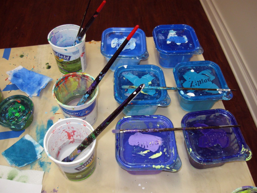
Pairs of Blue, Turquoise, Purple
Two saturation variants of each color allow for some interesting patterns. I opted to alternate heavy/light horizontally within color and vertically across color. Here is what it looked like after I established the major color areas and began to identify the minor color clusters:
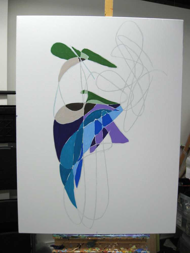
One application of each of the color pairs plus the second minor color cluster.
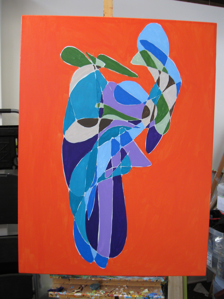
One Coat establishing all the color areas.
Fast forward many hours:
Music
On a side note I have been on a huge Afrobeat kick lately playing a lot of mid-70s Fela Kuti in the studio on repeat. Mostly “Gentleman,” “Zombie,” and “Expensive Shit.” This has been interspersed with some of my favorite Brazilian music, long-time obsession “Carlos, Erasmo” by Erasmo Carlos and “Africa Brasil” by Jorge Ben.
