I am continuing to experiment with screen printing. Now that I have the process down I am free to make more directed experiments with colors and overlays. I have found that 2 and 3 color variations work best. 4 and 5 colors seems to be too much for my current figures. Here are some of my more successful two-color variations:
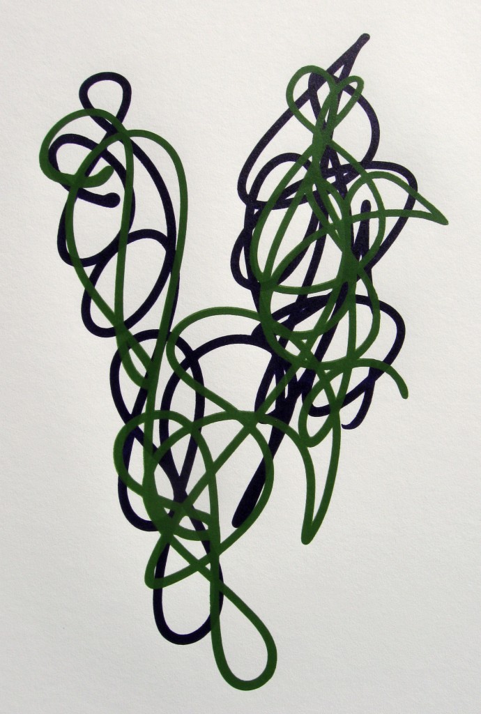
Dioxazine Purple and Chromium Oxide Green
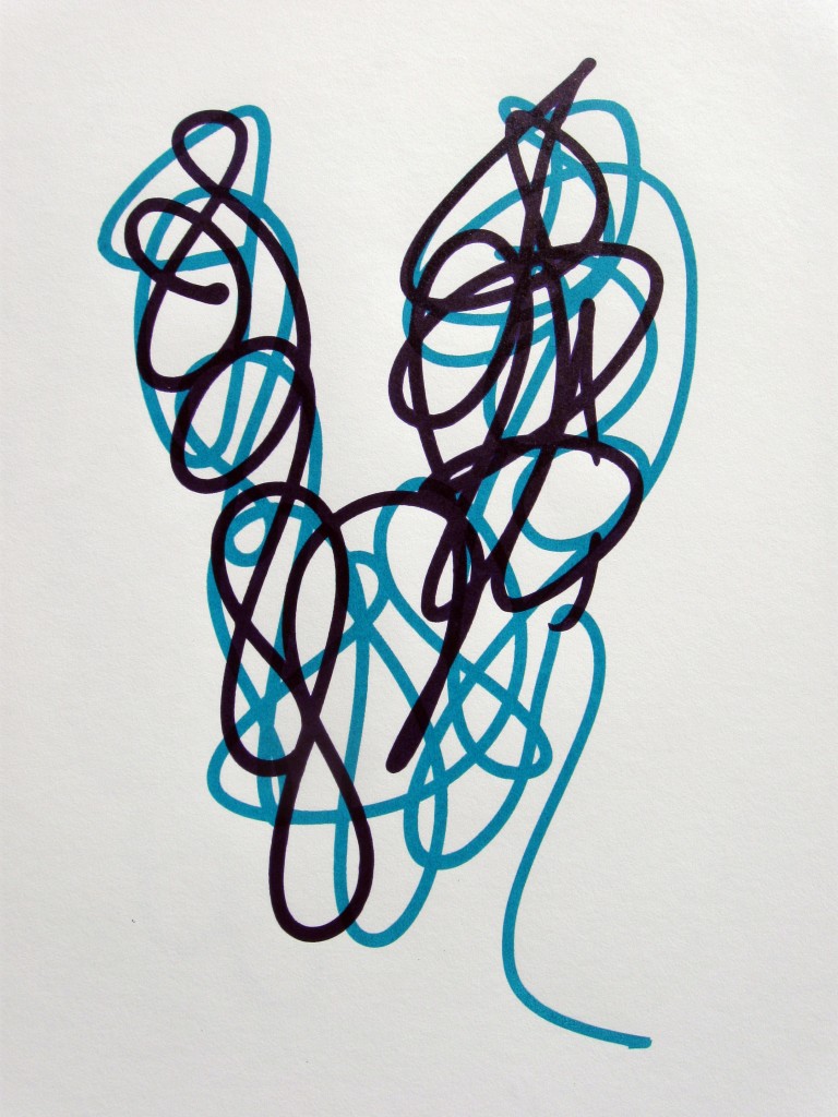
Dioxazine Purple and Turquoise (Phthalo)
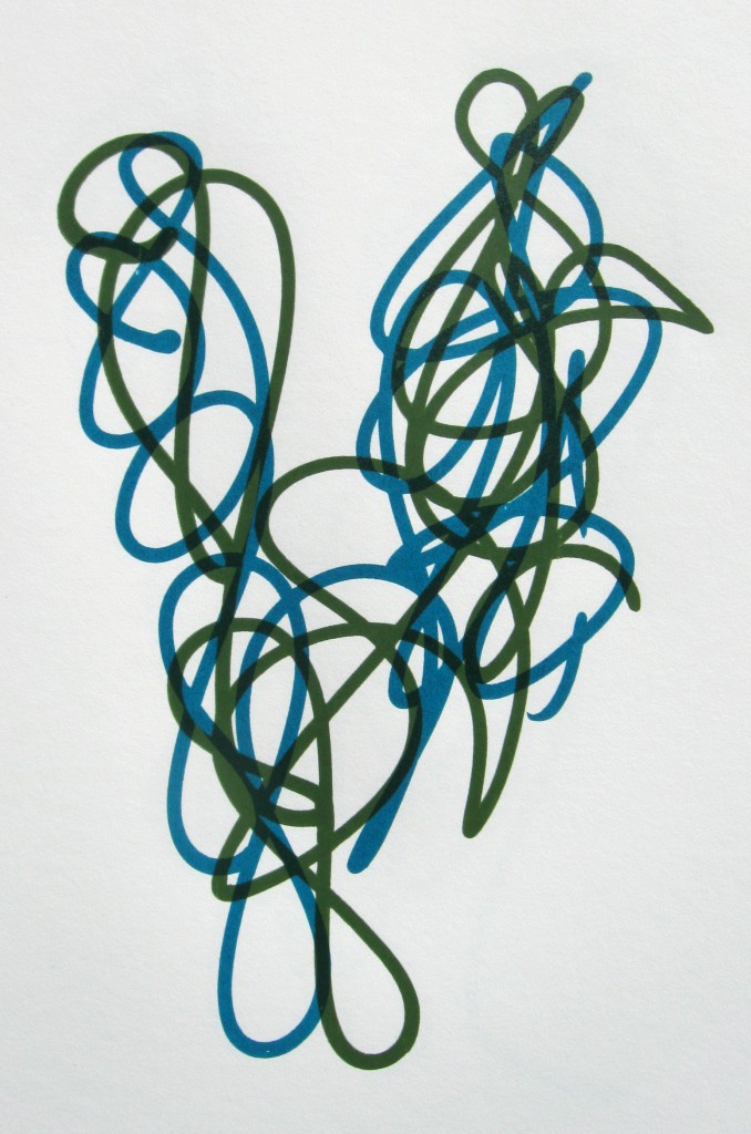
Turquoise (Phthalo) and Chromium Oxide Green
Three colors:
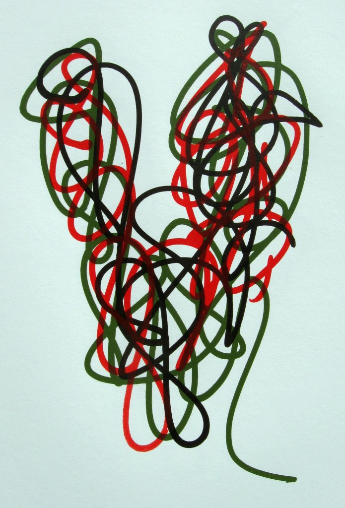
Raw Umber, Chromium Oxide Green and Napthol Red/Hansa Yellow
The green went down first, then the brown finally the translucent red. Because the purple is so dark there is only an overlay effect from the red. Either red over green or red over purple.
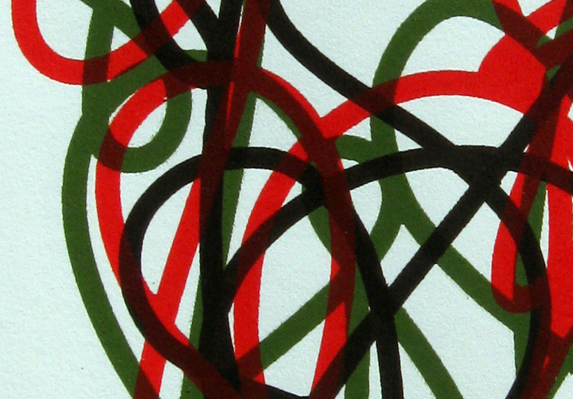
Raw Umber, Chromium Oxide Green and Napthol Red/Hansa Yellow (close up)
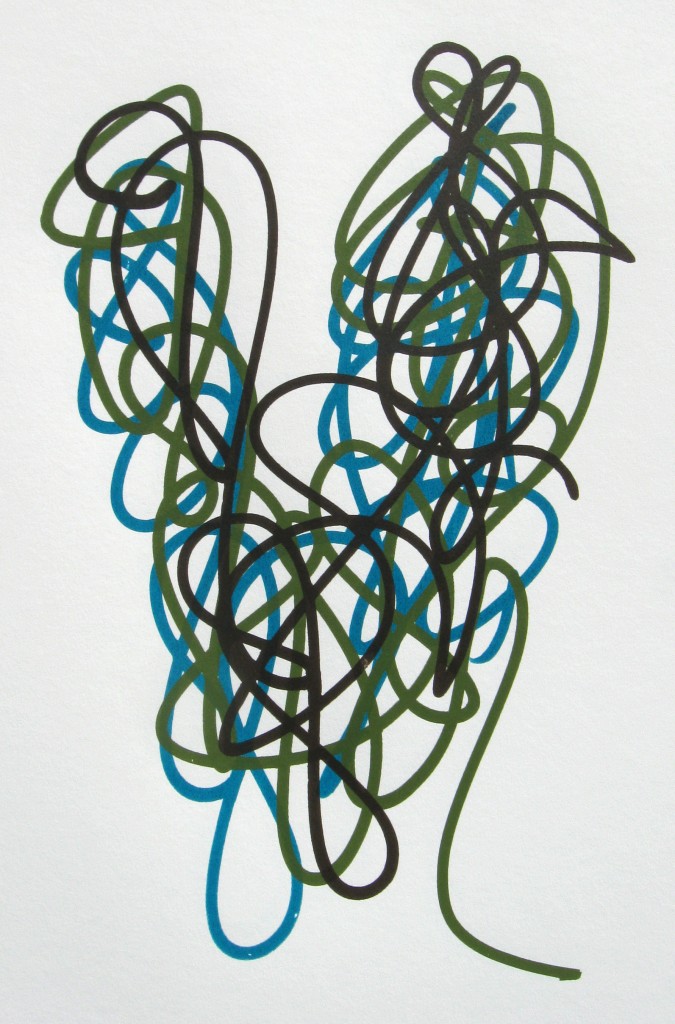
Raw Umber, Chromium Oxide Green, Turquoise (Phthalo)
Since the turquoise went down first, there is no overlay effect at all.
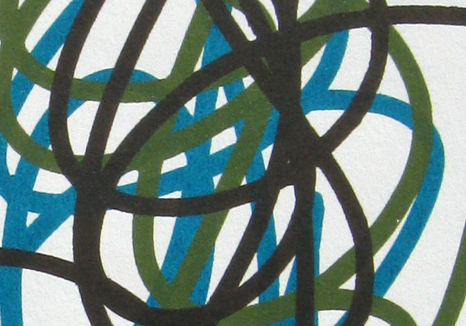
Raw Umber, Chromium Oxide Green, Turquoise (Phthalo) (close up)
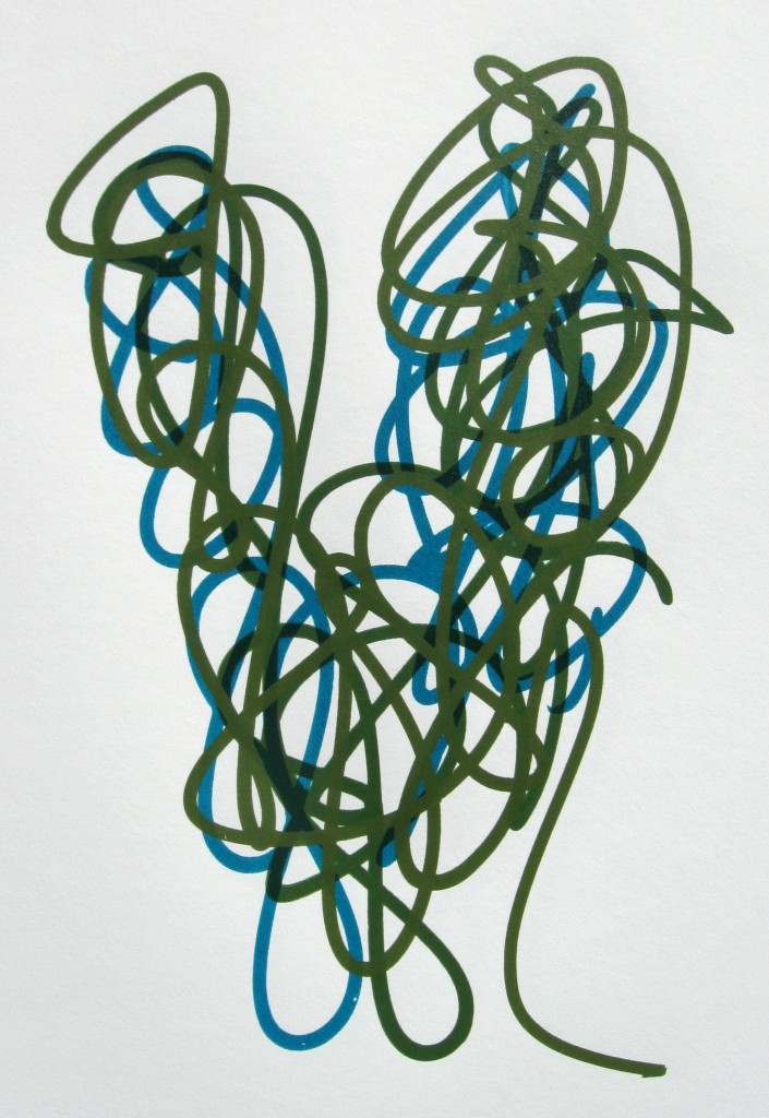
Chromium Oxide Green, Turquoise (Phthalo) and Yellow/Green Oxide
I used two greens on this one. The first layer was a full Chrome Oxide Green. The oxides are all pretty opaque colors. The Phthalo is very translucent, so there is an overlay effect on the second layer. The third layer is a mix of Chrome Oxide Green and Yellow Oxide which is also very opaque. This has been a favorite color mix of mine for a long time. I like that the overlay is limited to the middle layer.
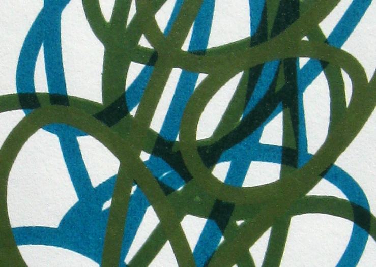
Chromium Oxide Green, Turquoise (Phthalo) and Yellow/Green Oxide (close up)
I am continuing to experiment with the technique of printing. During this recent set of prints I started playing with the ratio of Golden Screen Print Medium to paint. Using more than 50% medium with the heavy body paints definitely allows more transparent layers. This does affect the fluidity of the paint mixture though and you can easily over-flood the screen with paint if you are not careful. I found that with some of the medium to paint mixtures that I did not need to do a flood stroke. Just pushing the ink through the screen on one pull was enough to get a clean print.
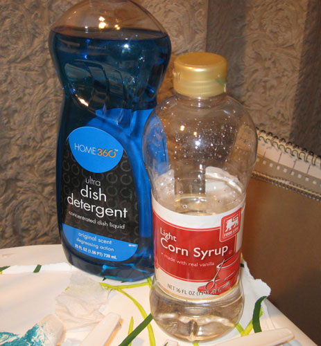
Corn Syrup and Dish Soap: cheaper and better line quality
I read somewhere that you can make your own drawing fluid from corn syrup and dish soap. I looked for recipes that specified how much of each but I couldn’t find anything. So I just started mixing them. Based on my limited experiments I can tell you I got best results when I used mostly corn syrup. If you add too much dish soap the fluid will be too watery and it will bubble too much. The main benefit to making your own, aside from much lower cost, is that you can control how thick it is. For the type of line work I am doing, I have found that a thicker drawing fluid produces better results.
I put a few of these up on the Prints page. I will add more soon.
Ross,
Fun to meet you yesterday and talk about pens, paints, screens, and streets. Thanks for sharing your process. I’m hosting a sketching/doodling/drinks ‘happy hour’ for art and design friends on March 3. Join us? See orangutanswing.com.
Dipika